W. Bradford Paley: TextArc
Artist(s):
Title:
- TextArc
Exhibition:
Creation Year:
- 2002
Category:
Artist Statement:
Whether I’m working as a designer or an artist, the essence of my work is interpretation. My goal as an interaction designer is to give visual form to the ideas of my clients. As an artist I try to do the same for beautiful hidden phenomena, in the hope that once seen they’ll be remembered even when my work is gone. Seeing things through the eyes of experts-people who have studied the intricacies of some process for years-has always fascinated me.
I interview experts and make little sketches to keep the new ideas clear in my mind, and to check that what I hear is what they’re saying. When they begin to recognize their own ideas in my sketches, my next step is clear: animate my sketches to replace the cumbersome, standard, table-field-toolbar-menu-button interfaces they typically use. The resulting “illustrative interfaces” take their shape from the minds of the people who use them.
As an artist I’m still building interpretations. We need an interpretative filter to see some of the most beautiful phenomena: think of the fluid arabesques created in the air by any simple gesture-invisible until we add tiny particles of smoke. I choose colors, shapes, and motions to reveal my subjects, to let them express themselves as clearly as possible. But the colors are not the subject, so I try to let the viewer know they exist while keeping them as simple as possible. I want my work to say “look how plain the filter is; the beauty must be in the subject.”
Other Information:
PROJECT PROPOSAL
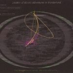
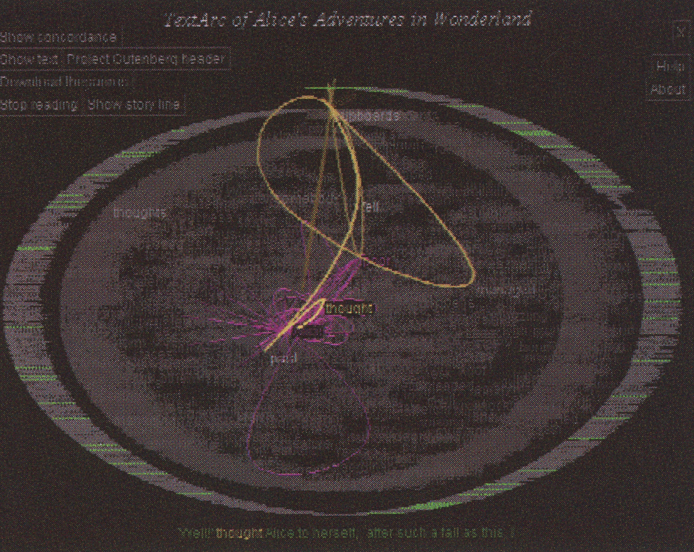
A text arc is a visual index/concordance/summary, a way to spatially reveal any text by letting its key concepts float to the surface. TextArc represents an entire text as two concentric ellipses. Every line from the text is drawn in a tiny font around a page almost touching the edges, then every word is drawn (in a readable size) just inside the first ellipse. Frequently used words get lighter, so in a story such as Alice’s Adventures in Wonderland key characters like Alice, Hatter, Queen, and Gryphon stand out, as do other words evocative of the story, e.g. poor, dear, door, and little.
Some words scatter inside the ellipses. This is the key organizing structure of TextArc: words that appear more than once are drawn at their average position. Imagine that each word is drawn on a tile and attached to each place it belongs in the story by a tiny rubber band. The net result of this rubber band tug of war is that words pull closer to where they’re used most often. Hence Gryphon appears close to its chapter near the end while Rabbit stays more central. The structure of TextArc space lets each viewer’s mind find its own path through the ideas in the text, pulled along by the brightness of the words and the meanings the viewer is primed to read.
Brad Paley gratefully acknowledges the invaluable input he received from people at and near Digital Image Design Incorporated (didi.com), including Cliff Beshers, JueyChong Ong, Greta Peterman, and Hai Ng. A more complete list of people involved is at TextArc.org.