“Great grids: how and why?” by Stone, Bartram and Gromala
Conference:
Type(s):
Title:
- Great grids: how and why?
Presenter(s)/Author(s):
Abstract:
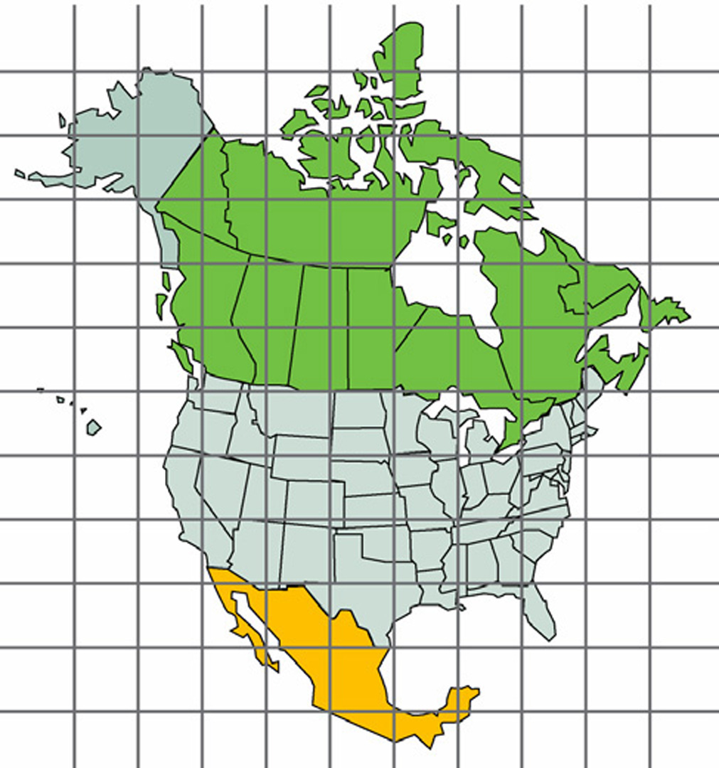
Grid design is surprisingly subtle. A grid that is too bold distracts and obscures, but one that is too light is illegible. A well-designed grid is legible when required, but does not create visual clutter or compete for attention with the information it supports. From the disciplines of art and graphic design, we know that there are many dimensions of subtlety and richness to such visual reference cues [Tufte 1998; Gombrich 2000]. Understanding both how these properties are achieved, and to what extent they can be generalized to elements beyond grids, is our broad research goal.
References:
1. Tufte, E. R. 1990, 1998 Envisioning Information. Graphics Press, Cheshire, Connecticut.
2. Gombrich, E. H. 1969, 2000. Art and Illusion: A study in the Psychology of Pictorial Representation. Princeton University Press, Princeton.
3. MacIntyre, B. and Cowan, W. 1992. A Practical Approach to Calculating Luminance Contrast on a CRT. ACM Transactions on Graphics 11(4): 336–347.
4. Legge, G. E., Rubin, G. S. and Luebker, A. 1987. Psychophysics of reading. V. The role of contrast in normal vision, Vision Res. 27, 1165–1171.
5. Findlay, J. and Gilchrist, I. 2003. Active Vision: The Psychology of Looking and Seeing. Oxford Press.
6. Gobell, J, and Carrasco, M. 2005. Attention Alters the Appearance of Spatial Frequency and Gap Size. Journal of the American Psychological Society, 16(8)


