“The Mohawk: A New Concept in Architectural Representation” by de Souza
Conference:
Experience Type(s):
Title:
- The Mohawk: A New Concept in Architectural Representation
Program Title:
- Tomorrow's Realities
Entry Number: 40
Organizer(s)/Presenter(s):
Collaborator(s):
Description:
The goal of computers in design is becoming more the enhancement of the design process and less the simple documentation of decisions. Most architects, though, are not following this revolution: they are using computers as drafting systems, only for the production of traditional drawings, with no change in the design or representation process. Architects haven’t started thinking with the computer: instead, they are designing first and then trying to adapt it to the existing software. In order to become successful with computers, architects will have to reconsider their fundamental notions on how to approach a project, solve, and present it.
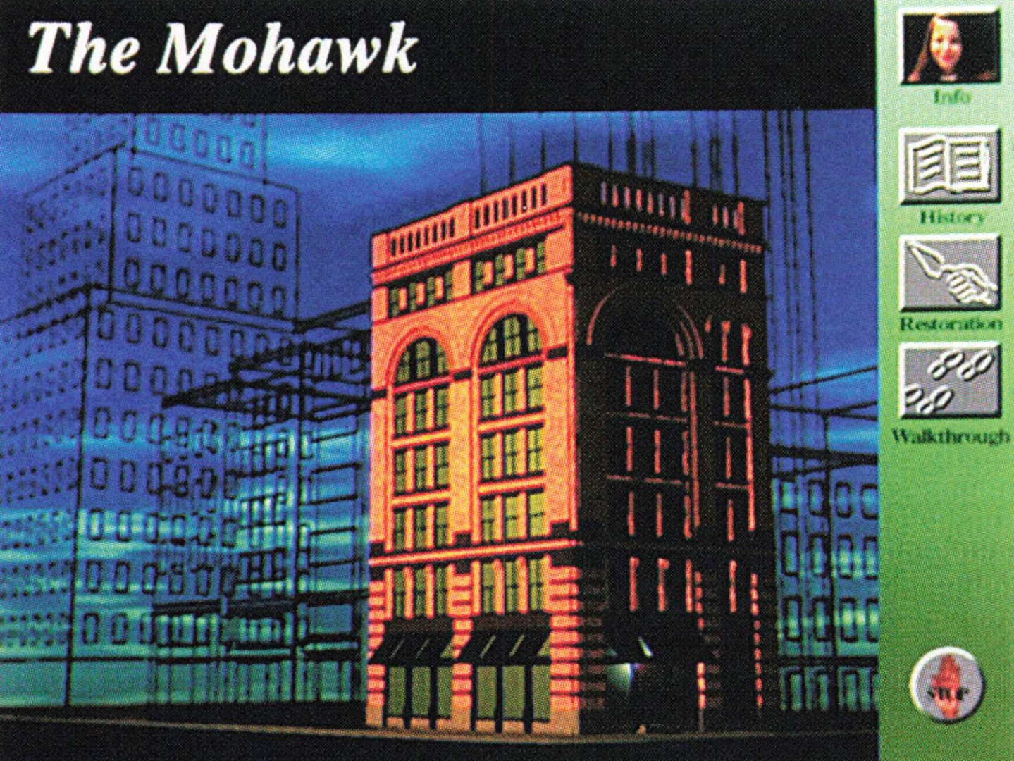
The Mohawk project differs from the traditional architectural representation methods. It makes use of hypermedia to display different kinds of information that, when put together, assume a complex result that is impossible to achieve by any media other than the computer.
The project consists of an interactive multimedia installation that combines architectural design, different computer systems, 2D and 3D techniques, interface design, and videodisk technology. It explores the newest technology available in computer graphics focusing on architecture: how the architect realizes the design and the way this process is presented to the client. It demonstrates how one can experience a space before it is actually built without having to “read” and visualize plans and elevations. It also helps clients understand the design in a deeper way by showing elements other than traditional drawings, like history and renovation details of a building. Exploring all this information on their own, clients feel they are part of it and become much more involved in the project.
The project is separated into three modes:
■ Walk-through: One can approach the hotel building from the square located right in front of it, enter the hotel, explore the lobby and take the elevator and get into one of the guest’s suites, being able to choose where to go and where to look at.
■ History: In this mode the user is able to see a video that shows the building as it is today, both inside and outside. At the same time there is a narration of what is being shown on the screen, together with information on the building’s history.
■ Restoration: This mode allows the user to see a slide show that compares photographs of the destroyed building’s details today with computer-generated images of how they were originally built, always focusing on the elements that have been badly restored.
The Design Concept
The concept for the design of the Mohawk is the building’s location in relation to the grid in which the streets of New York City fit: for midtown and uptown, such a grid is very regular, with streets and avenues forming perfect squares. As we approach downtown, it starts changing its shape, looses parallelism, and starts going in every direction.
The building’s site plan well illustrates the downtown’s loss of grid. Because of its location (on the corner of Hudson Street and Duane Street, which are not perpendicular), the building assumes a trapezoidal shape instead of a rectangular one. To emphasize this shape even more, the design lines were kept parallel to both facades, creating a very dynamic space.
Technical Notes
The animation of the building was done on a Silicon Graphics computer, using Alias 3.1 software. Because of the amount of data involved, the lighting is mostly fake by coloring polygon faces in different tones. The animation was transferred to a videodisk, together with live video footage. This videodisk is accessed by HyperCard external commands. Because of its capabilities, it can be played back and forth, giving the user a sensa


