Zack Booth Simpson: Shadow Garden
Artist(s):
Title:
- Shadow Garden
Exhibition:
Creation Year:
- 2002
Medium:
- Interactive Installations
Category:
Artist Statement:
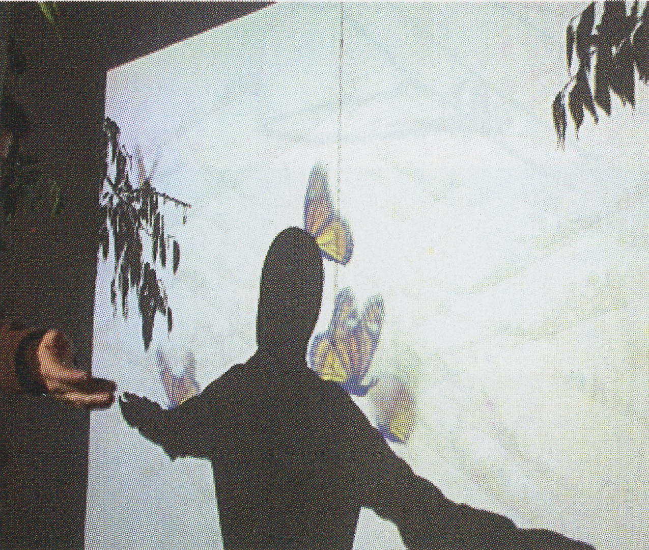
Shadow Garden is series of interactive pieces where participants discover a world that reacts to their shadows. The participant walks between a projector and a screen, casting a shadow. A computer paints images, through the projector, that appear to interact with the shadow in real time. The psychology of the shadow as an extension of one’s body is such a natural concept that participants immediately grasp the interface. The connection between shadow and body is so innate that many participants claim they “feel” the projected images touching them.
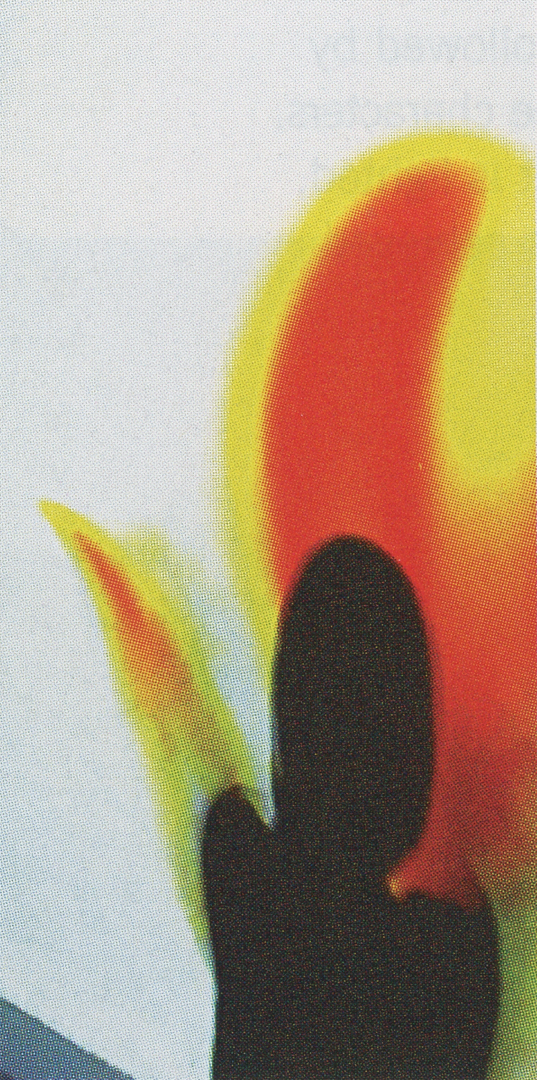
The work uses a garden concept to de-emphasize the technological and evoke wonder and awe. Often, digital artwork over-focuses on the technical by choosing modern themes that isolate participants from the virtual world into which the artist invites them. The organic nature of gardens puts the participants at ease and focuses their attention away from the technical gadgetry and toward the beautiful interactive imagery. Six independent systems are displayed on the same screen: a flurry of butterflies, a stream of liquid sand, trails of swirling flame, swarms of creatures like fish or ants, a diversity of growing flowers, and undulating colors of galactic star clusters.
Fundamentally, the pieces are neither about shadows nor gardens but rather the feelings created by interactivity. For example, participants attempting to catch butterflies will talk to each other saying: “Shhh! Don’t move, I’ve almost got one.” Sometimes they will shake with the tension of trying to hold still. Or, when playing with in the insect swarm, participants will timidly insert their hands to create a shadow and then jerk away with fear as soon as the creatures swarm towards them.
As they warm to the creatures, participants play with them as if they’re a school of fish and begin to enjoy them. It is such feelings, both mental and corporeal, that we, as artists, seek to evoke through interactivity.
Technical Information:
The computer, a standard PC at 800+ MHz running a common 30 accelerated video card, samples from a digital camera synthesizes images in real time that interact with the shadow. When latency is unimportant (“Butterflies”), relatively cheap USB Web cameras are used; in other cases (“Sand”), DV cameras over IEEE 1394 are used to minimize latency. Preferably, the projectors use LCD technology instead of OLP to minimize temporal aliasing between the camera and the screen caused by image flicker due to the OLP color wheels. Calibration between the camera’s point of view and the projector’s is achieved by a sampling method that permits non-affined (for example, around corners) mapping.
Process Information:
Much of my work involves creating simulations that often turn into tricky mathematical modeling problems. For example, a page from my journal dated 17 December 2000 shows my thoughts as I worked out the butterfly model for the first time.
Later, I realized that the butterflies looked better if I made the two wing polygons intersect a little bit. The next image shows a sketch of the revised wing model and notes the vertex functions. Also seen on this page are sketches from La Sagrada Familia. I was living in Barcelona at the time and apparently I had gone there that day; my journals are often intertwined in this fashion.
Often, enormous effort will go for naught. This image (below) shows work on a parametric model of a tree-like branch. The idea was abandoned after a few days of work when I realized how much time it would take relative to its interest level. This is the fate of 80 percent of my ideas.
One of the most complicated parts of the system is the calibration that no one but me ever sees. The sketch below shows some of the original design for how the calibrator would function. Most of this is a diagram for a state machine. I often model computer algorithms in a storyboard fashion such as this.
The image below shows the first diagram that illustrated the technical workings. I had already built the system by the time I drew this but had not yet installed it formally. When I drew it out carefully, I realized that it would be better to project from above rather than from waist level (as I had drawn) because it would allow people to pass undisturbingly behind one participant. A quick after-thought sketch in the corner captures my realization as well as the fact that I would have to pay for this with a keystone effect.
Of course, ultimately all of my artistic ideas must be realized in code that must be debugged. Little scraps of paper litter my desktop with typical programmer hieroglyphics. The image below appears to be debugging notes regarding address of a corrupt linked list written on the corner of a doctor’s prescription.
Other Information:
Additional Images:
1: 17 December 2000
2: 20 April 2000
3: 20 December 2001
4: November 2000
5: May 2001
6: June 2001


